
Why Do Companies Debrand?
Reality Check Please
To be clear, debranding is a form of rebranding. However, while rebranding means changing or updating your company’s logo, debranding describes the trend of companies adopting minimal, flat logos. There are several reasons why companies update their visual identities, but first, let’s look at what influenced the popularity of so many high-detail logos.
Before the invention of computer-design programs, logos looked similar to now in colour and depth because it was harder to print complicated patterns and design complex imagery by hand. Past iterations of Coke and Pepsi logos are perfect examples.
As technology became more sophisticated, intense detail, depth and realism emerged in logo design, exemplified by the hyperreal cola logos of the 2000s.
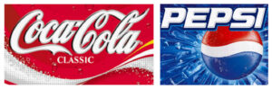
Then finally, in a full-circle moment, these brands shed their 3D effects (fake ice and all) and reverted to their historically flat selves today.
Coke and Pepsi aren’t the only ones, either. The allure of robust design programs influenced companies and their designers to add the 3D strokes, lighting effects, patterns and textures that are now so heavily associated with the early 2000s. Brands are not immune to trends, and they surely aren’t immune to the appeal of powerful new design tools.
As Ben Schott of Bloomberg puts it: “it’s clear that many recent debrands represent, at least in part, a return to sobriety after a spasm of software-abetted intoxication.”
But not all brands suffered from the same hyperrealism that many soda companies did, and a more practical reason for these trendy makeovers exists: mobile-first design.
Mobile-First Focus
As screens shrank from desktop down to smartwatch size, the need to simplify user experiences became critical. Visually simpler designs are often perceived as easier to use, which is especially prudent in app and website design. Logos must look good in tiny formats such as home screen icons and favicons, which are only 16 x 16 pixels in size.
As shown in so many tech logo evolutions, size constraints on UX designs have pressured designers to remove unnecessary elements from logos. Airbnb placed considerable effort into designing an “A” shaped icon that works well for mobile apps and online experiences.
![]()
In the name of mobile-first design, The City of Vancouver attempted a redesign in 2017. In a lateral shift, officials approved a different block letter font to represent the City and said goodbye to its flower illustration in the corner. The debrand received widespread criticism, as many found it oversimplified. One critic said, “my eight-year-old could do that.” It was also said to be very similar to the City of Chilliwack’s logo because of the font but was less distinct as it lacked an illustration.

However, the redesign was liked by some who acknowledged the functionality of the block letters online, and the mayor of the time, Gregor Robertson, who described the City’s original logo as “lame” and “bland…with a squiggly thing on it that really doesn’t mean anything to anyone.” Ultimately, Vancouver’s new logo was scrapped and the original remains.
In the Name of Sexy
Sometimes, organizations change their branding just to look cool.
Take the Gap, for example. In 2010, the jean giant changed its logo from its former glory into a modern-day Helvetica bold nightmare.
![]()
To transition from “classic American” to “modern, sexy and cool,” the company did away with its unique stretched font and opted for a generic, block letter bore, sharing little to no resemblance to its former self other than a blue gradient square protruding from the “p.”
After only a week, the Gap reversed its decision and publicly admitted the mistake, stating: “we’ve learned just how much energy there is around our brand, and after much thought, we’ve decided to go back to our iconic blue box logo.”
Is Debranding Bad?
Updating branding is an incredible tool for companies. When done correctly, rebranding can help companies evolve, and reflect their progression and maturity. It also helps position products correctly in the face of changing consumer preferences. When done poorly, it can leave a product unrecognizable and irrelevant. Here are some things to avoid when debranding.
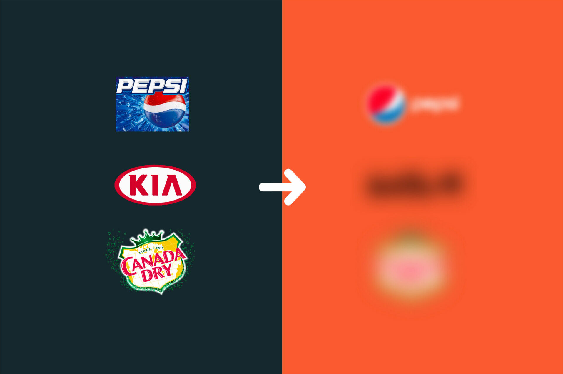
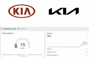
Perhaps one of the most controversial debrands in recent years is Kia. Kia’s new logo is so different from before that people now think there is a new car brand around called KN; since the logo’s debut, Google trend data shows that the number of people searching “KN car” has skyrocketed to over 30,000 searches per month.
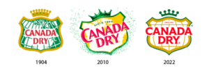
When rebranding, it’s vital to maintain elements of the original design, especially when a logo relies on symbols more than words. Canada Dry Ginger Ale recently debranded its logo to look modern and minimalist. The updated look is excellent because it’s fresh, modern, and easily recognizable. The new logo reimagines the company’s 1904 logo, which shows just how cyclical branding is.
It’s perfectly fine to change a brand’s image entirely, but only for the right reasons. Molson Coors, for example, has rebranded recently to reflect its products outside the beer aisle. As CEO Gavin Hattersley puts it: “Our logo is a celebration of the new look and direction of Molson Coors Beverage Company.”
![]()
Naturally, companies grow and change, and so does their product offering. As such, rebranding is often necessary to reflect a brand’s new status. But sometimes, rebranding is unnecessary. Take the Vancouver Public Library, for example, which recently changed its long-standing logo for a more generic, Gap circa 2010 logo.
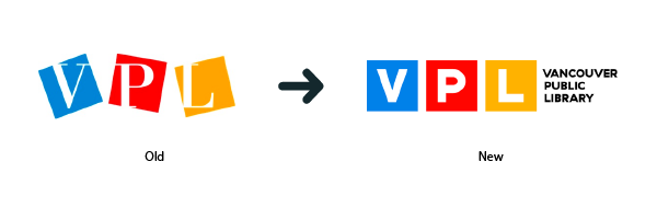
The main issues here are that when used in icon format & without the accompanying text, such as on the website, it bears little resemblance to the original. Additionally, it has lost its fun and playful characteristics; the new icon is overly authoritative for the brand and doesn’t relate to books, as the original letterpress-style font did.
It’s important to note that there is always a reason to rebrand; there will always be design trends to follow and managers who crave a “fresh look.” But, to create an effective branding image, companies must back up their branding with a well-directed strategy:
- What goals are we hoping to achieve in the future?
- How do we want people to perceive us?
- How will this rebrand reflect our new product/sevice offerings?
These are critical questions to consider when crafting your brand strategy. Molson Coors has found immense success in recent years pursuing beverages beyond beer, such as canned vodka soda and spiked soft drinks. And, as their brand strategy changed, so did their logo.
It’s unclear how the new VPL logo reflects a new direction, new product offerings or a new brand personality for VPL; instead, it comes across as just another brand following the block letter trend. And, as the Tropicana OJ redesign disaster showed us, rebranding for the sake of rebranding doesn’t always work.
Debranding Is The New Branding: What’s Next?
Over the past decade, thousands of companies have dropped their shadows, textures, and details, opting for minimalist, flat logos. The trend partially represents a correction to the hyperreal logos that became popular in the early 2000s thanks to technological improvements. It also reflects the rise in emphasis on a mobile-first user experience, as designers need to squeeze logos into app icons and smartwatches. Debranding shows that brand identities are susceptible to trends, begging the question: what’s next in logo design?
Once a trend becomes too mainstream, the counterculture adopts something new, and the cycle repeats. But for now, debranding isn’t going anywhere, and there is plenty more room for brands on the minimalism bandwagon. Don’t hold on for too long, though, because, as Coke and Pepsi have shown us, things can always come full circle.

Comments