
Bringing The World Closer Together
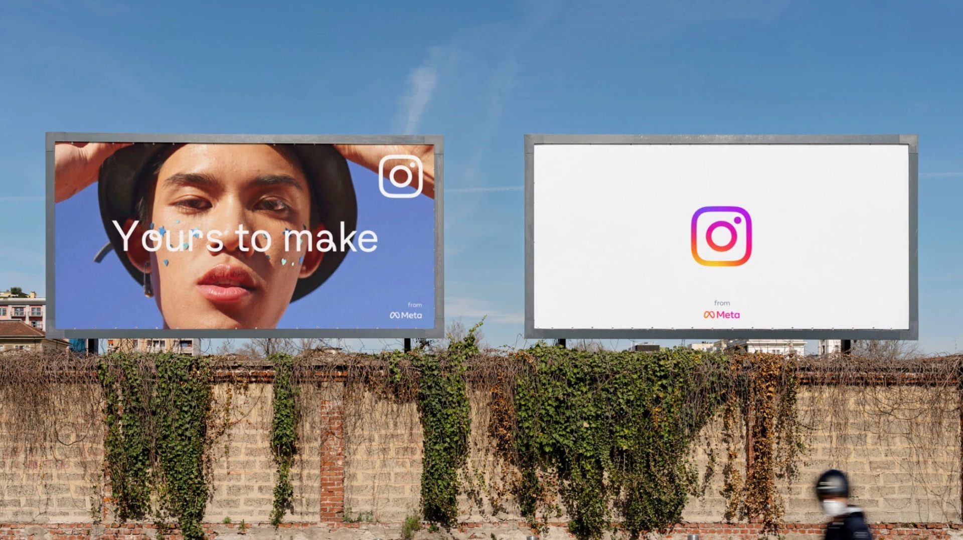
The goal of Instagram’s parent company, Meta, has always been to build community and bring the world closer together. As Instagram develops its platform for exploration, sharing, and pushing culture forward, it places a new spotlight on our closer-than-ever global community. As immersive and inclusive user experiences focus on accessibility and legibility throughout the design process, the redesign nods to Instagram’s heritage, yet places user expression at the platform’s forefront, allowing for continuous evolution.
Three key objectives guided the Instagram visual rebrand:
- Establish a distinct identity with their first custom typeface, inspired by their design foundation and designed in multiple scripts.
- Bring more vibrancy with more depth of colour to their gradient, designed to feel illuminated rather than one-dimensional.
- Create a modular branding system with design applications across multiple types of channels.
Font Designed for the Future
“A typeface of-the-future via the past, it seeks to push (typographic) culture forward.”
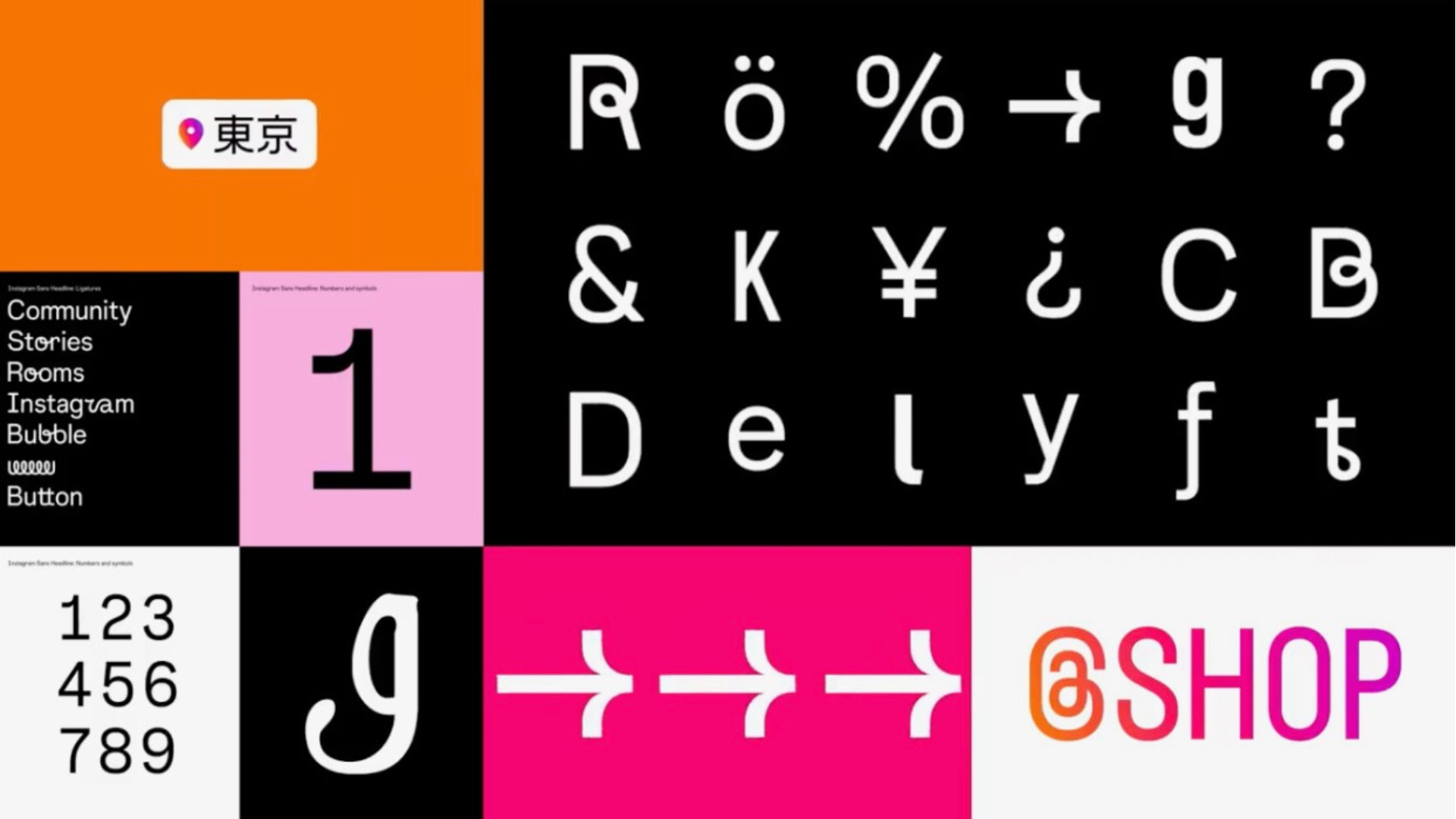
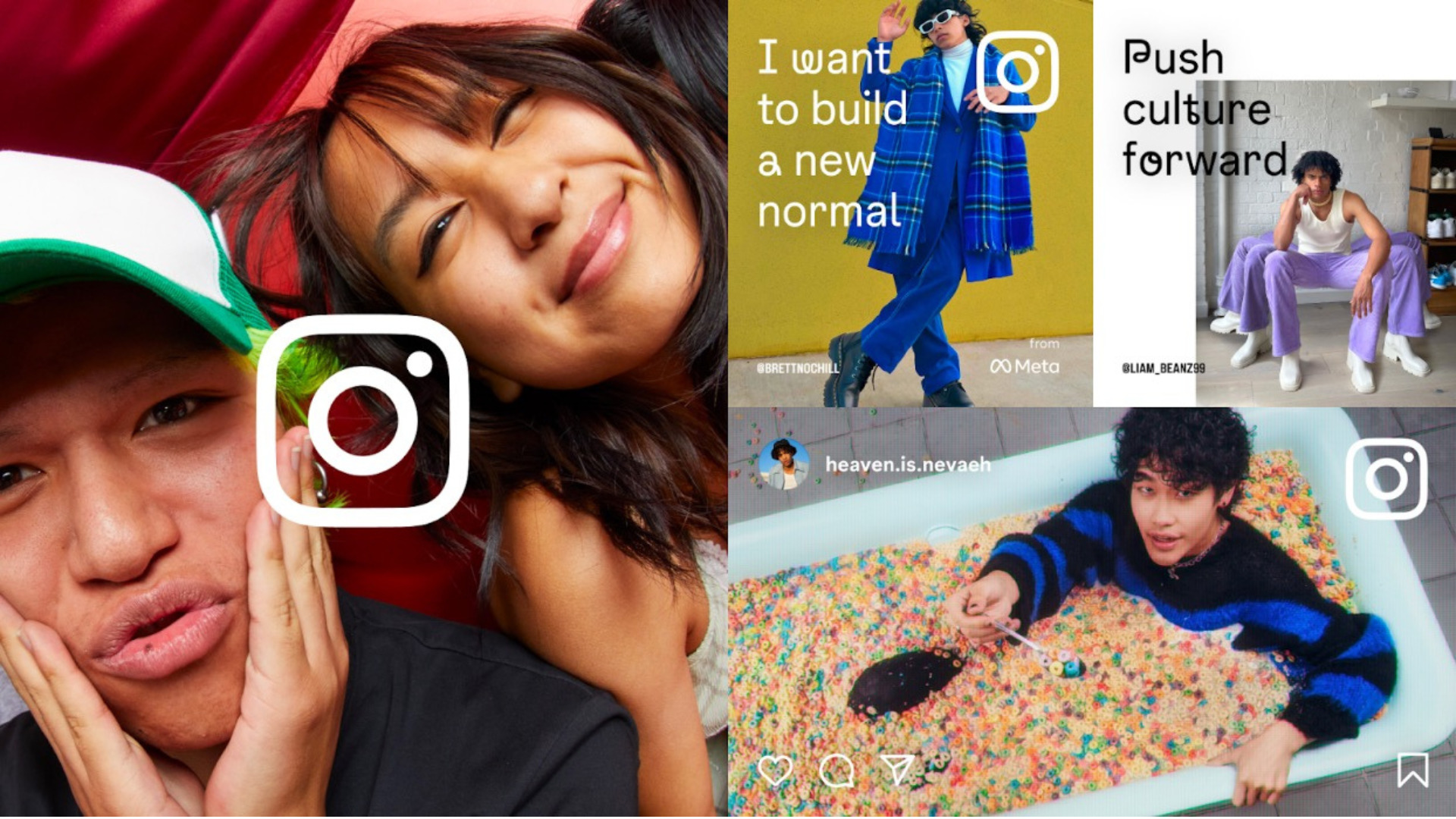
Instagram’s brand new typeface, Instagram Sans, draws on distinctive qualities of the Instagram logo and wordmark, which has softly rounded corners that place it somewhere between a circle and a square—a form they call the “squircle.”
“We knew we wanted the typeface to work harmoniously with our logo, but it was one of those aha moments when we unlocked the delightful story of literally referencing its form. Those in-between moments of a perfect circle and a square, which we lovingly call the “squircle,” show up throughout the typeface.” —Cynthia Pratomo, Creative Director, Instagram
Typography was the most crucial and challenging element in rebranding a platform with more than a billion users worldwide, but Meta designed Instagram Sans to flourish globally. The contemporary remix of grotesque and geometric styles highlights accessibility and global scripts at its core, able to express a range of styles in any language.
Breathing Life Into Light
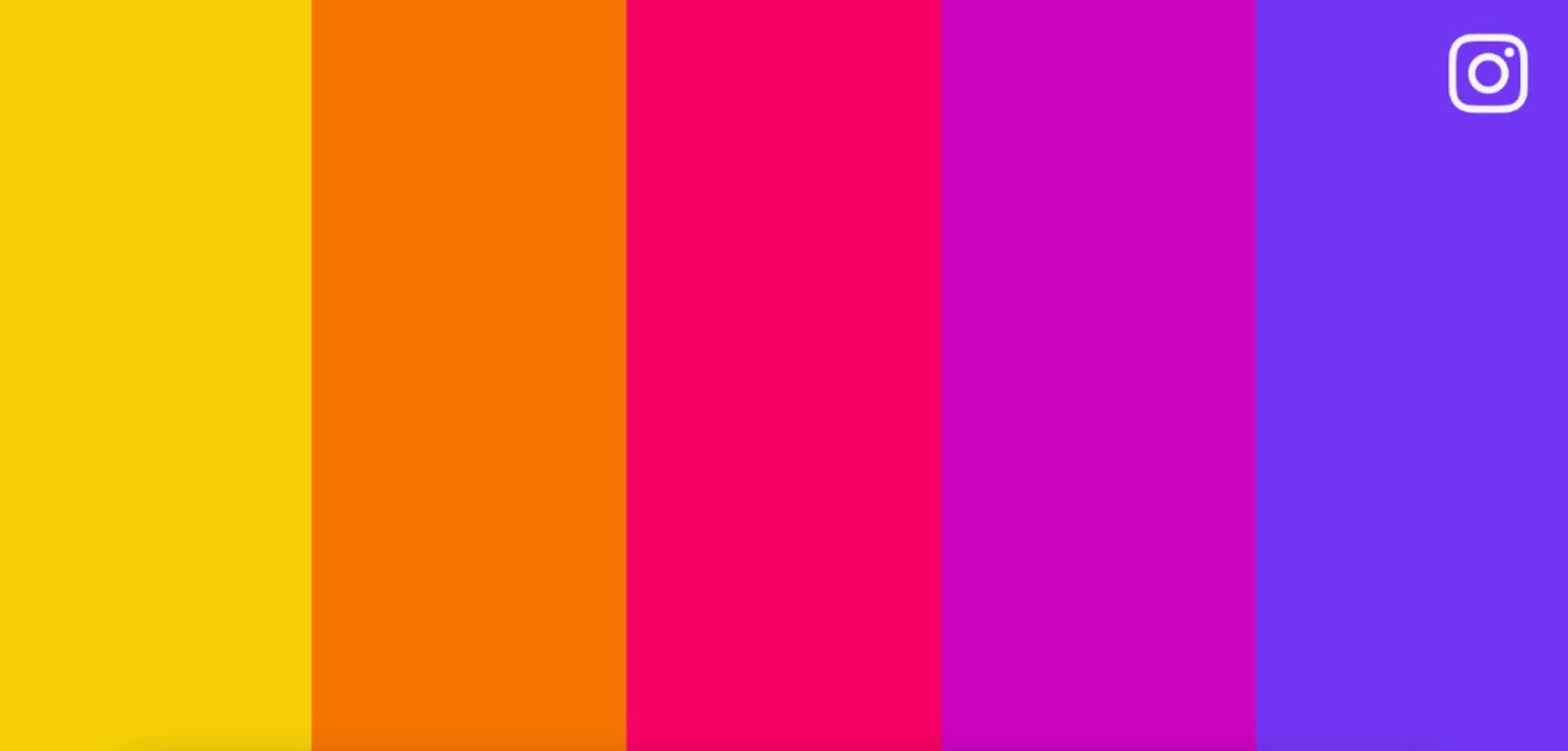
Instagram took its most recognizable signature, the gradient, and brought it into our new world, where things are more three-dimensional than ever. The gradient appears throughout Instagram branding and within the app, showing up in features like Create Mode and Instagram Story rings to breathe new life and movement into the visual.
Instagram worked with 3D digital artist and motion designer Rose Pilkington to create a custom digital lighting rig in Cinema 4D to bring the brand’s refreshed gradient to life. The ultimate goal was to create something that “feels like it’s made of light,” Rose says, “so that it feels illuminated, with a sense of depth.” After numerous iterations, lighting tests and digital mockups, she realized that simplicity was the key. “Everything had such subtle details, and the key was not to reinvent something,” she says. But instead, to embellish, enhance and refresh. Instagram’s new 5-colour palette makes up the gradient, also created with a vibrancy unique to the brand.
No More Borders
Instagram has refreshed its layout to focus on community and content through a full-bleed user experience. Mimicking TikTok’s seamless design, this update will change how Instagram users view photo and video content on their feeds.
The full-bleed layout will be the most apparent update in this rebranding initiative, and users will likely take a second to adapt to the change. However, if we’ve learned anything from the past couple of years, people are very adaptable and will soon forget about the pre-COVID platform.“The world is so familiar with the Instagram brand that making any type of change is challenging. We want our system to be true to the spirit of Instagram—not simply change for the sake of change. That’s why the simplicity of the design system refers to what we all love most about using Instagram: it’s always content and community first.” —Cynthia Pratomo, Creative Director, Instagram.
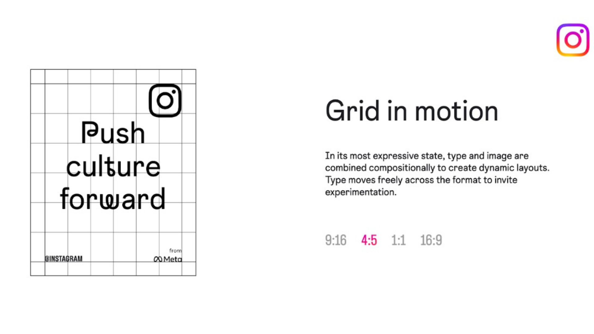
Pushing Culture Forward
So what do we think of Instagram’s new identity? The Kipling socials team is excited to play with the new font and incorporate it into our Stories and Reels content (the updated location tag stickers look especially aesthetically pleasing!). With the new full-bleed layout, it will be interesting to see digital marketing professionals test and select a new prevailing aspect ratio for brand content creation; or perhaps there will no longer be a standard to follow.
Instagram Update 2022: Final Thoughts
If one thing is for sure, TikTok’s format is slowly becoming the industry standard, with its full-screen viewing capabilities dominating the content space. Consumers are converting more than ever on TikTok, so it makes perfect sense that Meta is redesigning the Instagram user experience to keep up with ByteDance’s disruptive movement.
It will be interesting to see which platform prevails in 2022, with Instagram focusing on short-form video content in order to compete. The last time Instagram adopted another platform’s style was when it created the Stories feature in 2017, based on Snapchat stories. Instagram Stories has since proved to be a dominating feature on social media, so they will have no problem keeping up with TikTok’s platform success.
Comments